
Hello, my name is Wing Leung! I am a Digital Artist and Graphic Designer.
I enjoy creating bright and colourful work. My designs are influenced by organic shapes, celestial, fantastical, and mythological inspirations. I am especially enthusiastic about designing meaningful and beautiful ways for people to connect.

Copyright © 2021 Wing Leung. All rights reserved.
Copyright © 2021 Wing Leung. All rights reserved.
SPEC WORK | 2021
Procreate, Adobe Illustrator, Adobe Photoshop
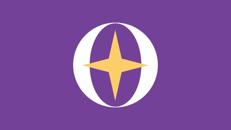
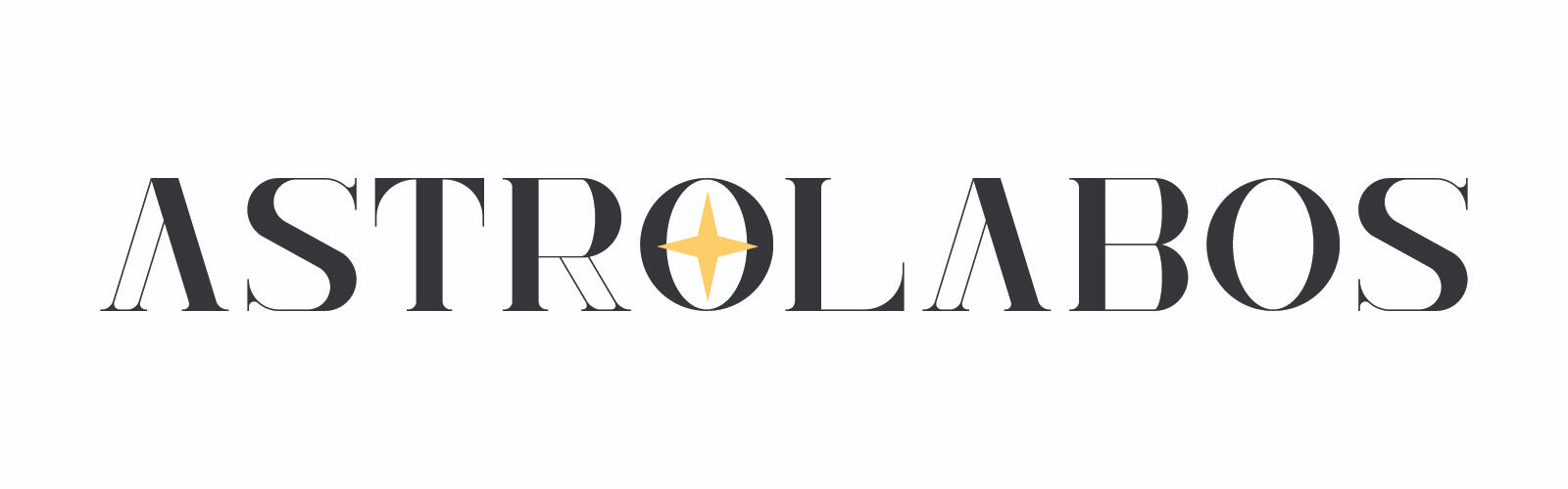
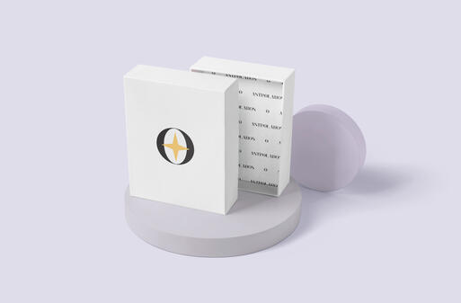
ASTROLABOS is a branding project for a conceptual gift store with celestial inspirations. The word "astrolabos" is the ancient Greek word for the astrolabe - which is an astronomical device with various functions. The astrolabe is considered a handheld model of the universe.
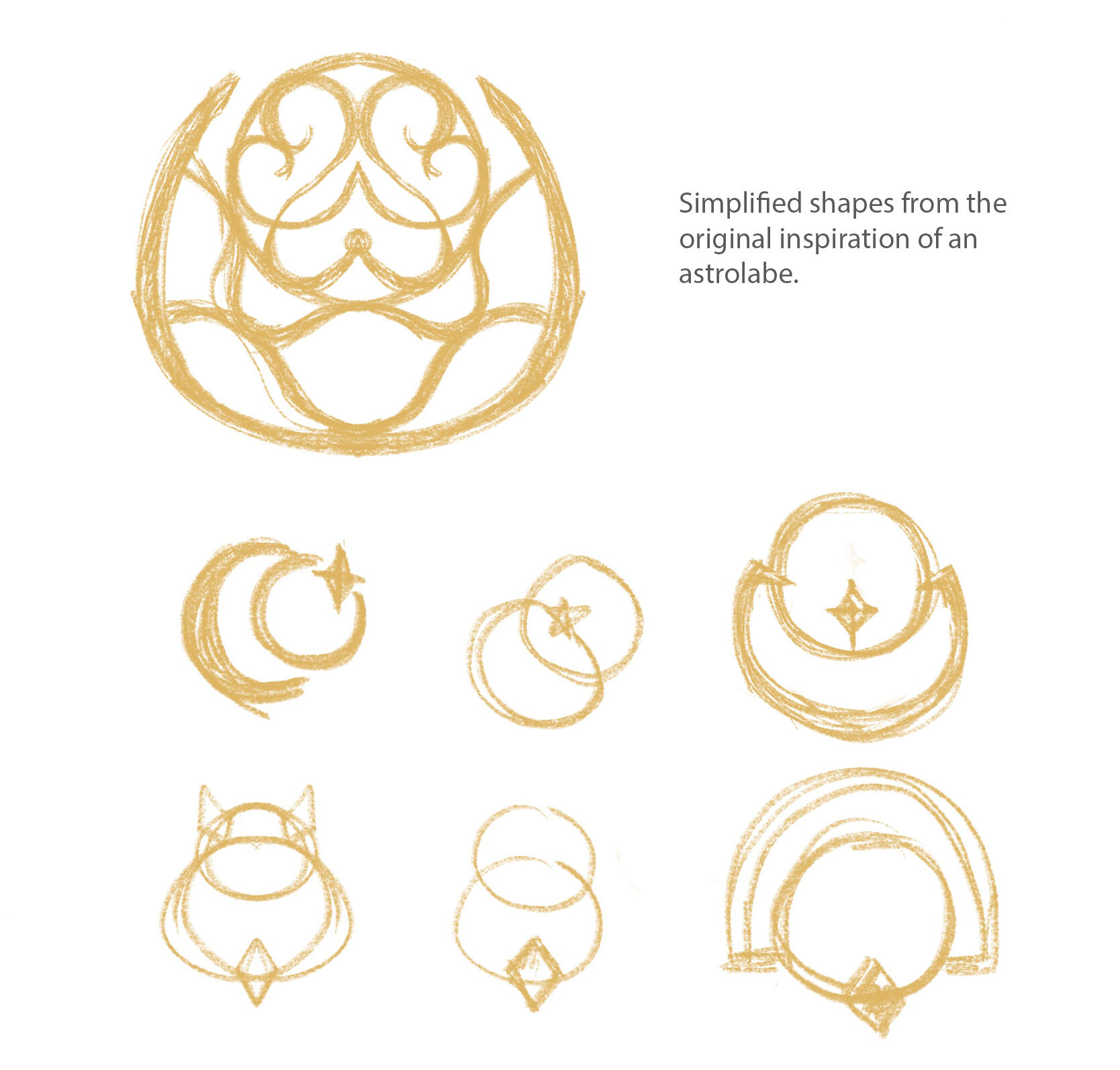

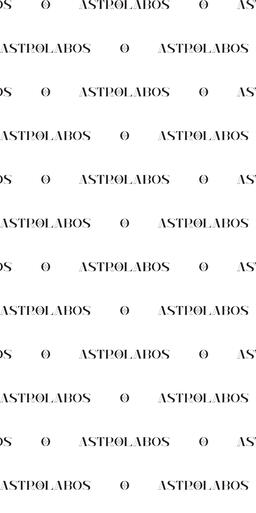
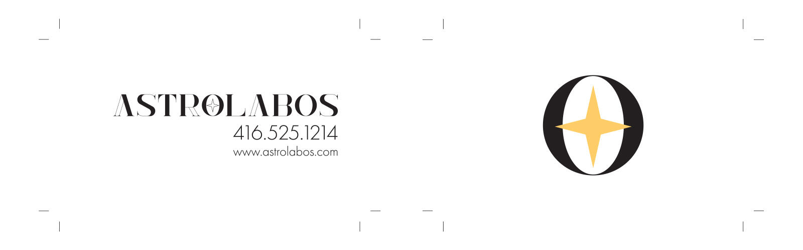
Font chosen due to the contrast between the fill and white space resembling different hands and layers of an astrolabe. The key colours were decided from the inspiration of a starry sky. Purple and yellow (gold when metallic) can give off a royal and celestial image.
Initial Logo/Branding Ideas consists of the typography itself and an icon inspired by the multiple rings of an astrolabe and moon phases. This moon phase (left) icon later simplified to the right version using the Branding Typography "O" and the star in the middle. The "O" represents the main frame of the astrolabe and the typography itself has semblance to two crescent moons similar to the initial design. The O encompasses the star, symbolizing its astronomical functions and concept.
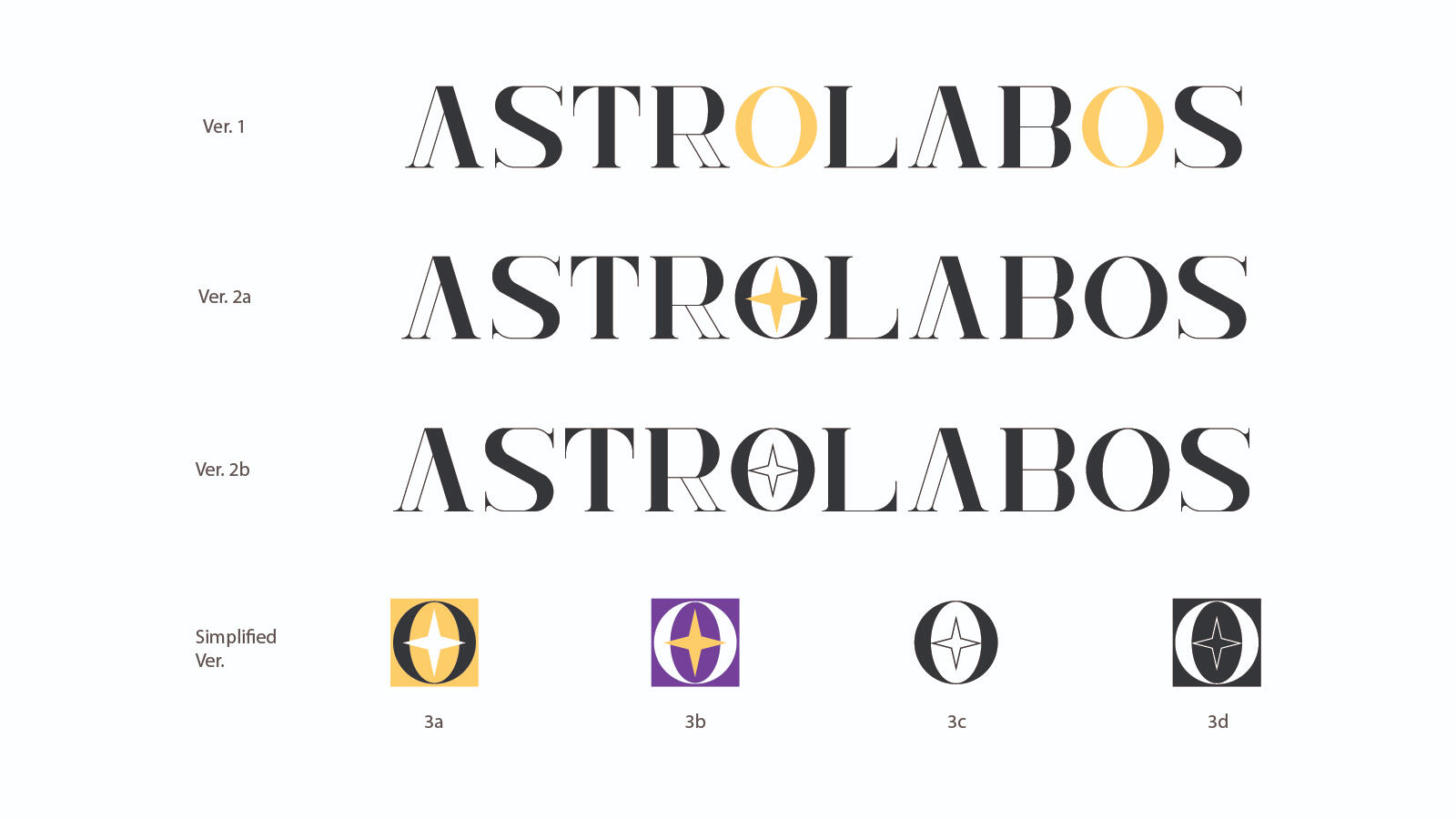
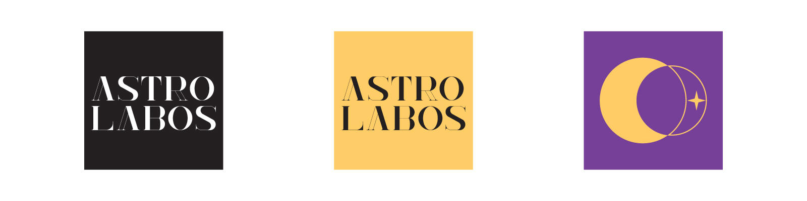
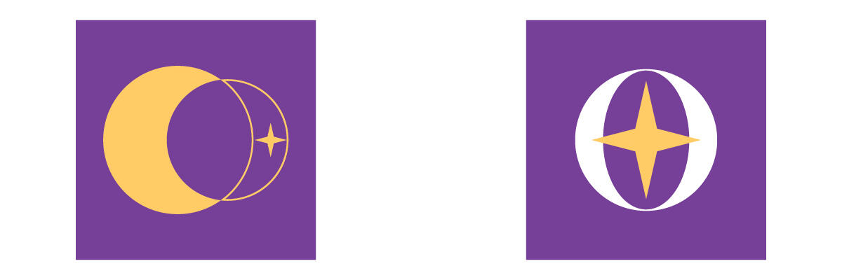
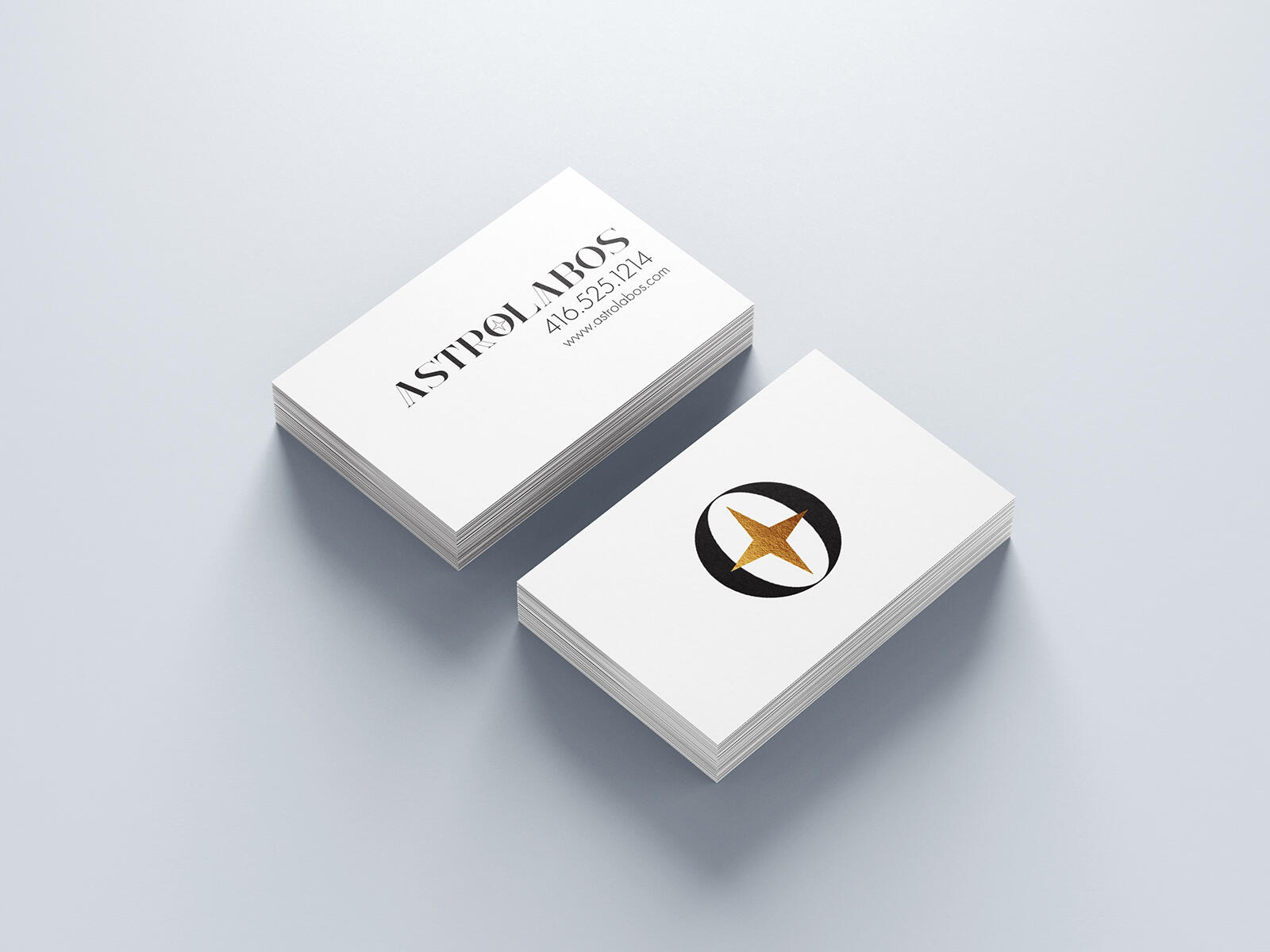
Final versions of the branding designs. While Version 1 is a colour variant of the initial base idea, the coloured Os in the branding are meant to resemble rings or frames of the astrolabe. Version 1 is simple and minimal, with a touch of accent colour that could be made a a gold metallic.
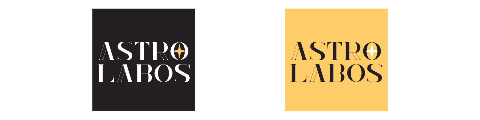
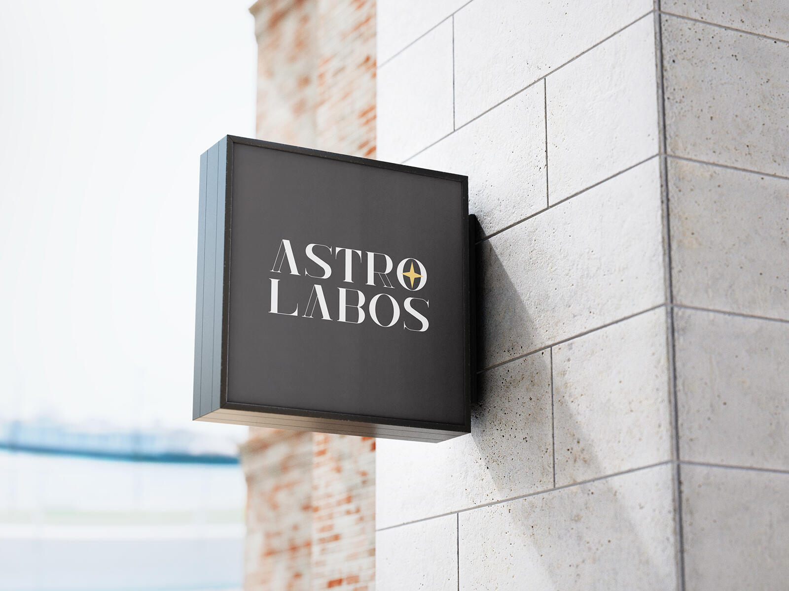
The stacked logo can be used as a shop sign or as a letterhead logo instead of the simplified versions. The versions shown above are colour variations of logo version 2a.
The main colour of logo version 2a (colour version 3b) can be interchangeable between black and white depending on the background colour it is placed on to. Version 2a/3b can be used for other darker colour backgrounds as well as black and white. Meanwhile, for lighter backgrounds that are not white, colour version 3a can be used instead for better contrast for the accent point. In other instances, the accent point of the logo can be made metallic or holographic for an even more attractive look.

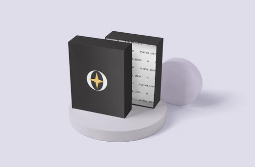
Logo version 2b (in colours 3c and 3d) is adjusted for outline usage and black & white print-use, such as: tissue wrap, heat-transfer receipts, stamps, seals, and stickers.
Copyright © 2021 Wing Leung. All rights reserved.

SPEC WORK | 2021
Adobe Illustrator, InDesign, Photoshop
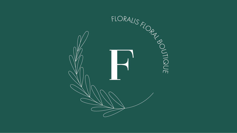
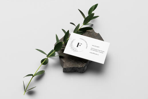
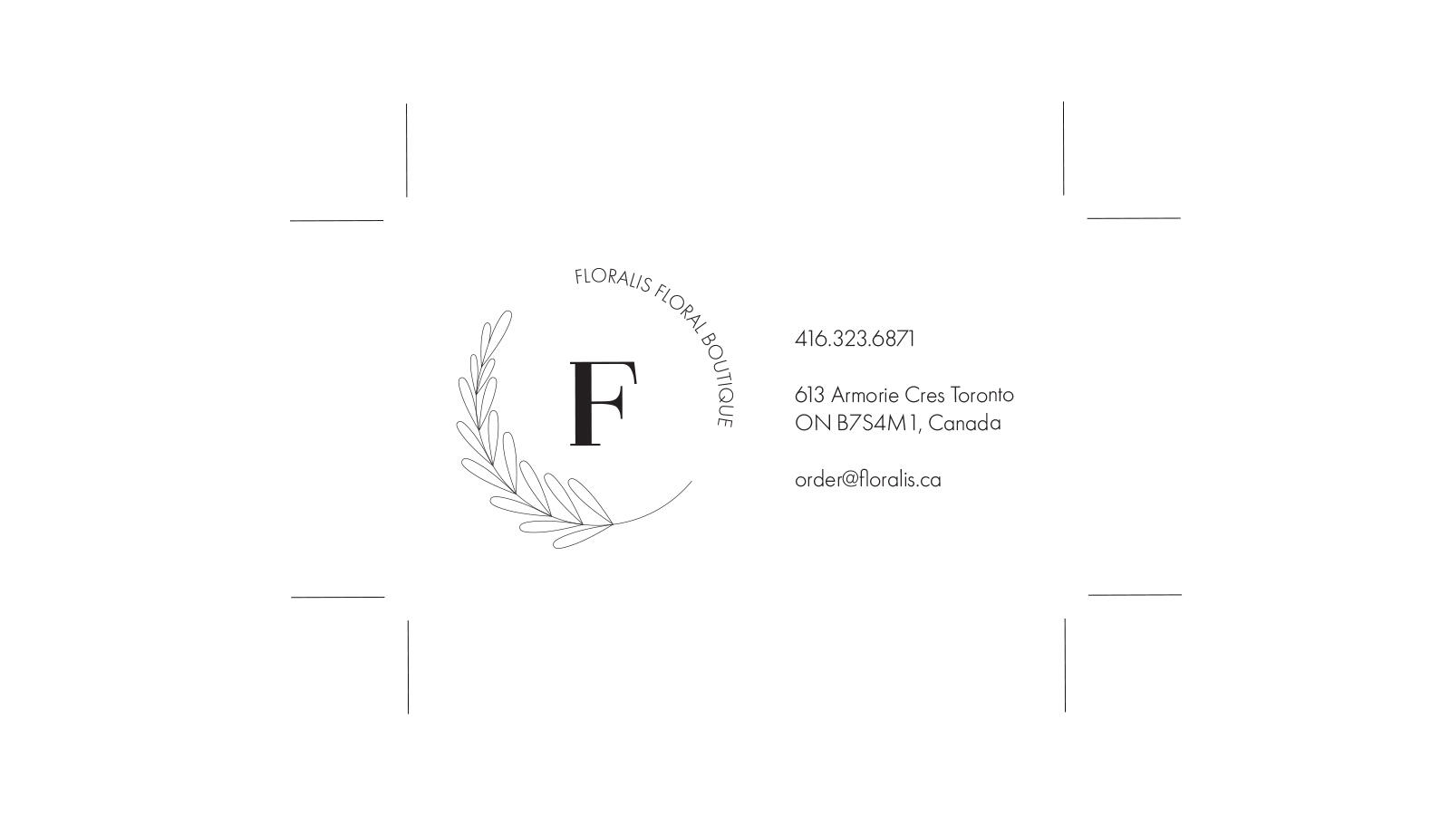
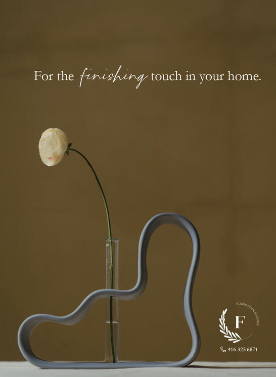
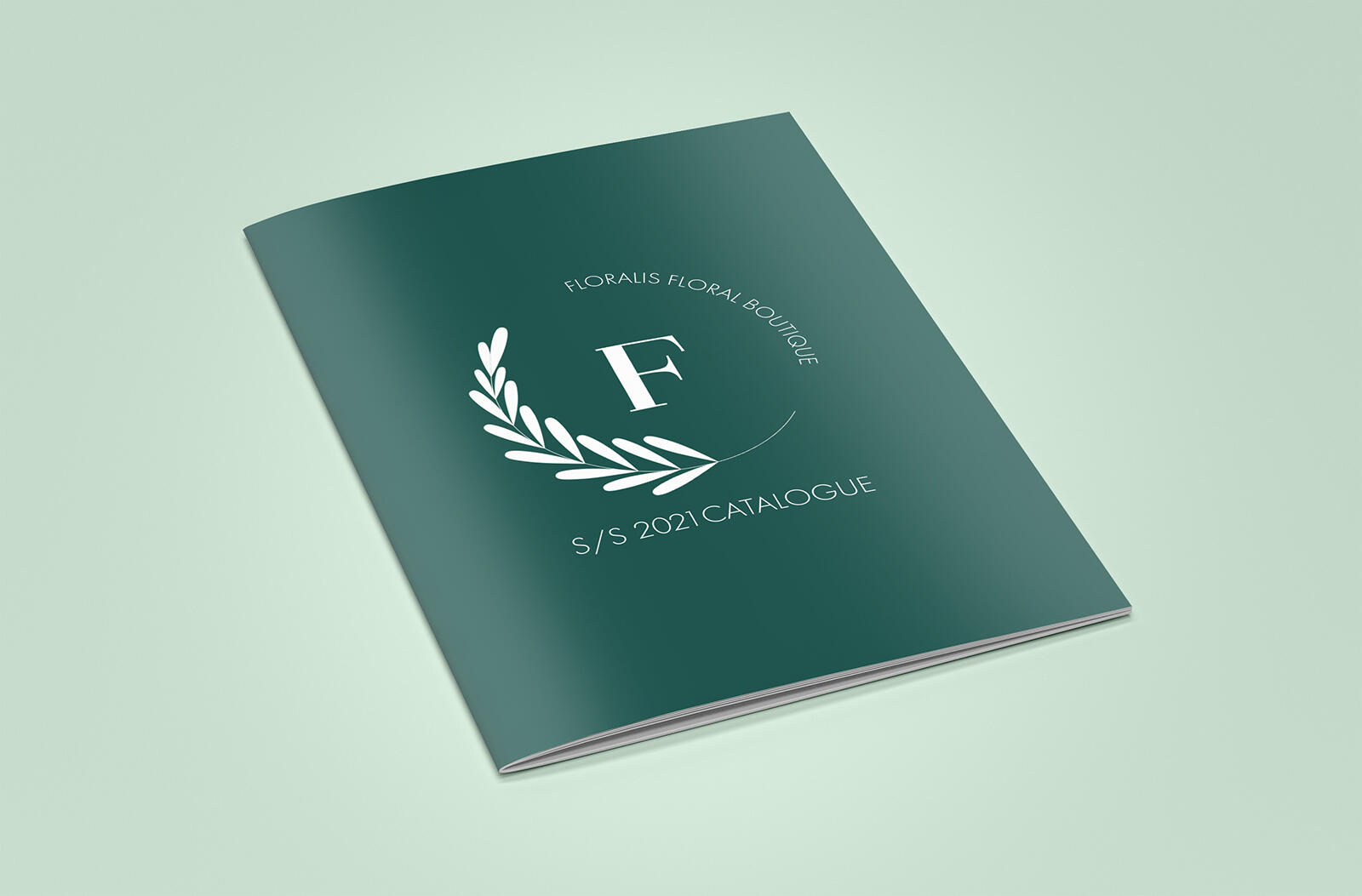
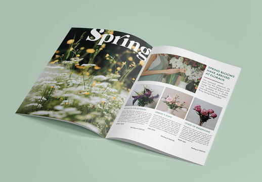
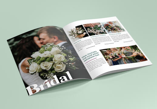
FLORALIS is a branding project for a conceptual floral boutique. The branding concept is inspired by the Roman Goddess of flowers and spring, Flora. The goddess Flora was known to be one of the most ancient of Roman deities and one of fifteen to be assigned an official priest, the flamen FLORALIS, to serve them and their cult. Before Flora became a goddess, they were once a nymph named Chloris who was known to be the one who transformed Hyacinthus, Narcissus, and others into flowers.
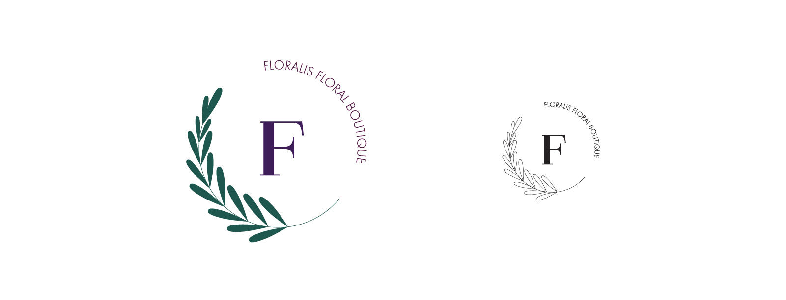
As a goddess of Greek and Roman descent, the idea of a laurel plant comes to mind. While there are many types of laurel plants, the Cherry Laurel leaves were chosen as the main motif. The cherry laurel is able to bear berries and the leaves tend to look more round as the leaves tend to curl inwards. The leaves of the cherry laurel are dark and glossy on the top side but a pale green on the bottom. This plant can also bloom showy flowers in the springtime. As such, the cherry laurel is a good match for the image of Flora and Floralis.Flora, previously Chloris, was associated with pale or yellow green tones, but the chosen colours are deeper for a more lush effect. The key colours are more cool toned also due to the idea that Flora is married to a deity of wind, Zephyrus or Favonius, who is often depicted in a cool-toned coloured robe. The wine colour depicts Flora's previous identity as a flower nymph and also as a goddess of youth and fertility. Deep purple symbolizes the power and magic that Flora holds as a goddess.

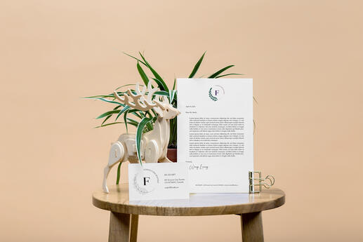
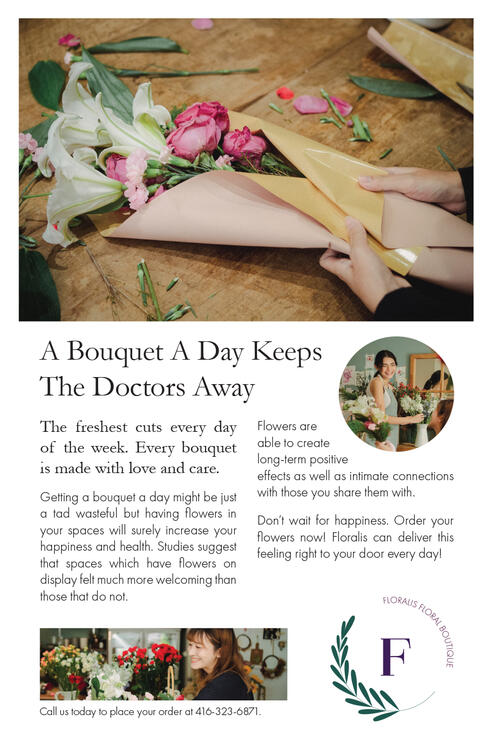
An idea for the boutique is to have each bouquet represent an individual story or myth pertaining to Greek or Roman origin. It allows the consumers to have a novel experience with the brand which is unlike most other floral boutiques. The stories can be read through the seasonal or monthly catalogues and the website.
Copyright © 2021 Wing Leung. All rights reserved.
SPEC WORK | 2021
Adobe Illustrator, InDesign, Photoshop
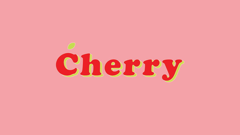
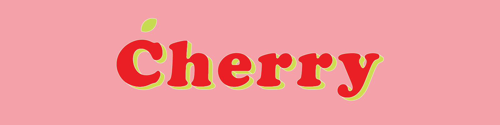
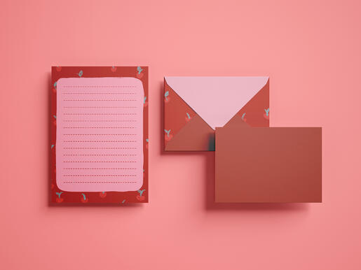
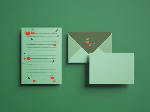
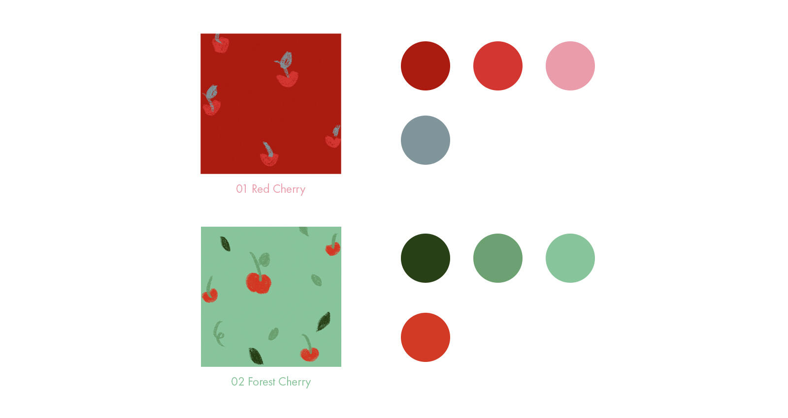
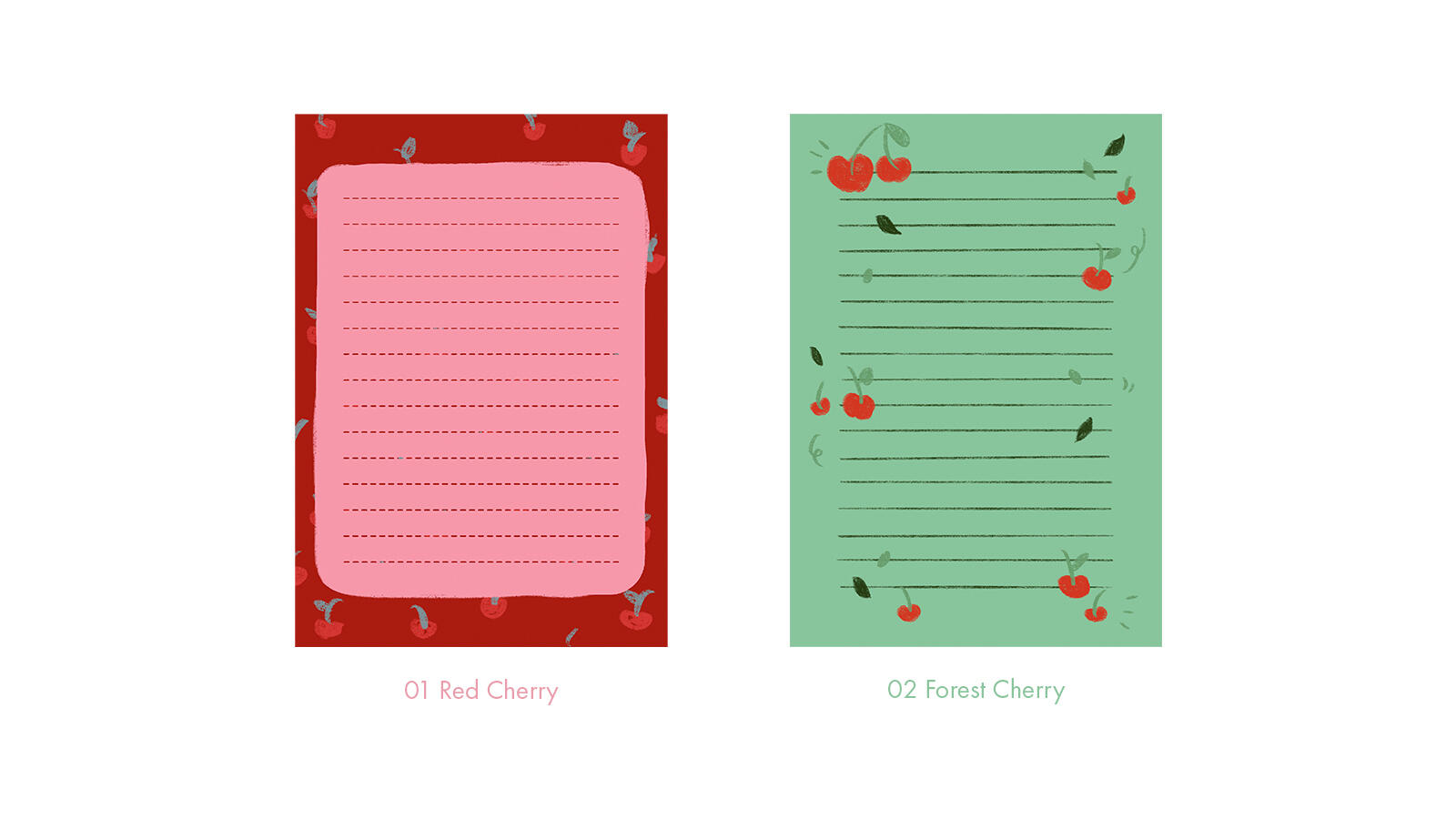
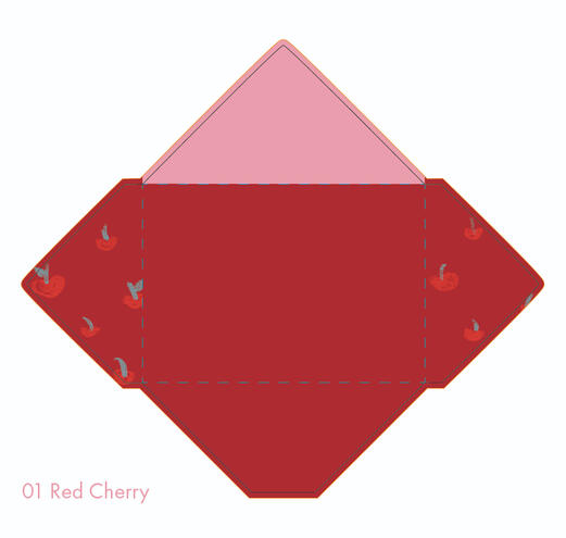
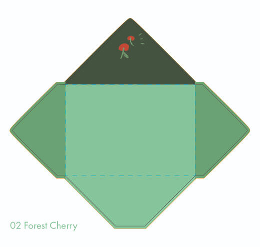
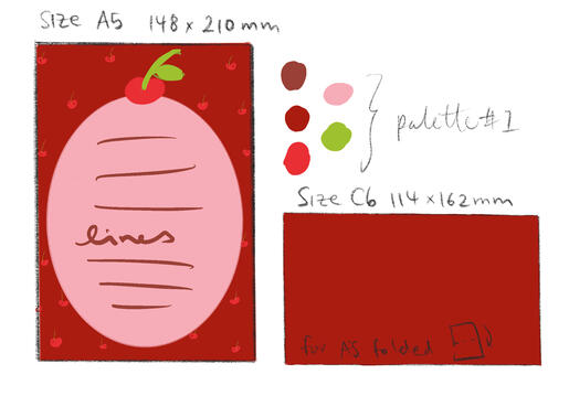
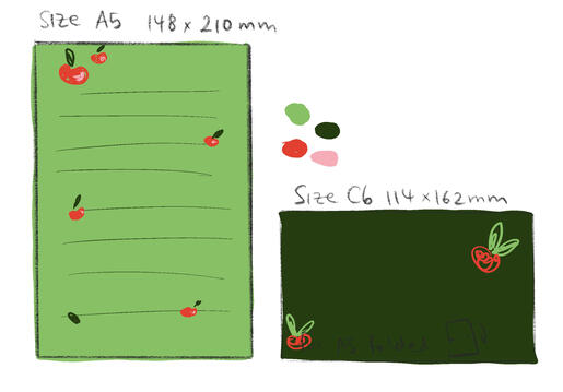
CHERRY is a conceptual letterset collection inspired by a colourful cherry aesthetic! This collection showcases vibrant and cheerful colours that make your letter writing experience more joyful and energetic! The Cherry Collection currently has two different designs: Red Cherry and Forest Cherry.
Copyright © 2021 Wing Leung. All rights reserved.

ONGOING PROJECT | 2021
Procreate, Adobe Illustrator, Adobe Photoshop
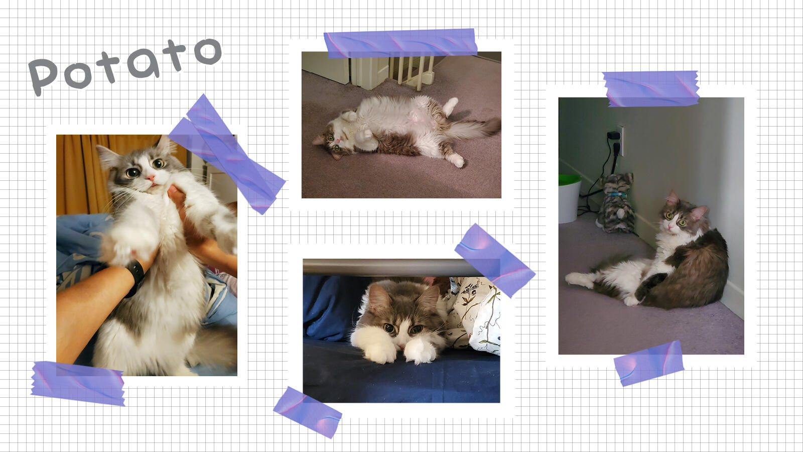
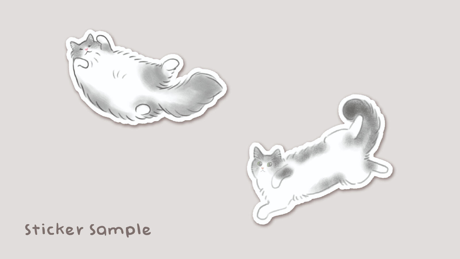
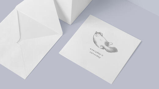
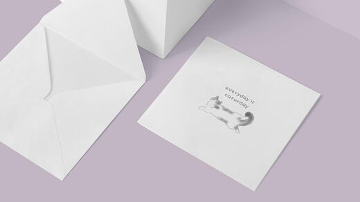
Everyday is Caturday is an ongoing personal collection project with my own pet cat - Potato - as the main mascot. The project will consists of different stationery pieces such as cards and stickers. Additional characters may be added in the future.
Copyright © 2021 Wing Leung. All rights reserved.